Design Course
Design Analysis and Critics
Rationalising Design
by
Visual Order with words Part 2
Assignment: Image
• Visual Order for Words:
In communication design, an important factor to be considered is the amount of information to be conveyed. It may vary upon what one wants to communicate, in what quantities, and to whom. Communication, therefore, could be for a leaflet, a telephone directory, a brochure, or a poster.
The common criterion that stands out in all these mediums of communication is to define the order of priority to their related information. When the amount of information is less or the types of information are limited, hierarchy of information in a group or groups needs to be highlighted. In such situations the role of emphasis shifts with respect to each group. It can be also termed as developing a sense of visual/logical sequence in the information. For the upcoming task (task 6) we will try to chunk information in groups to understand the concept via the presented hypothetical situation.
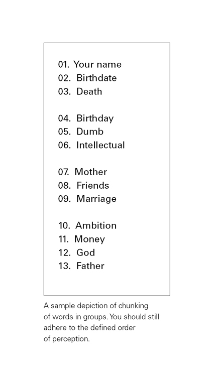
Task 06:
The users are supposed to perceive the same numerical order of words in the solution of this task, as they did in the preceding task. But additionally, the objective is also to make the user perceive four distinct groups consisting of elements (1 to 3), (4 to 6), (7 to 9), and (10 to 13), respectively, of the predefined numerical order. This chunking of elements into four groups should not conflict with the individual perception/sequence of these elements from (1 to 13). Here the subject is free to use all elements and principles of design, except the element colour.
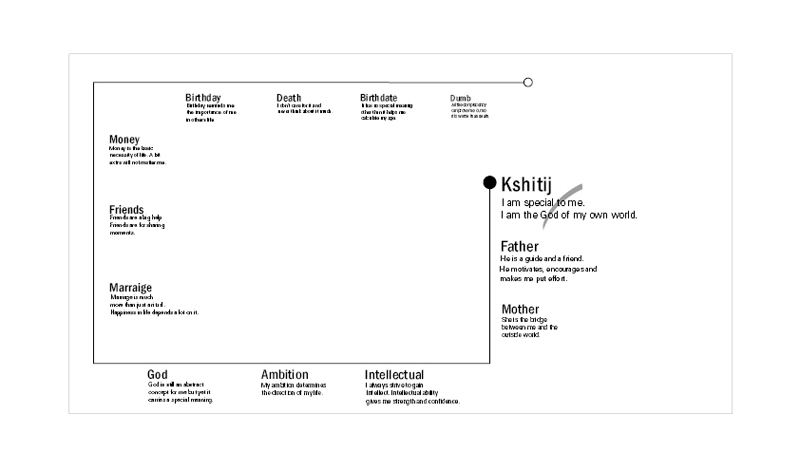
• 6c Student Solution:
• Feedback:
A designer has successfully employed the principle of proximity when the reader instinctively reads the correct caption for each illustration on a page.
Considering the objective of the task, grouping does not seem to be evident in the solution illustrated here. The user tends to follow the flow of a form and this principle has been effectively used in this solution. But the flow should also validate another important task of the reading direction. The reverse flow of reading direction from the word ‘intellectual’ to ‘God’, even if it inherits the conventional tendency of left to right, is bit uncomfortable and add stress on to the reader, encouraging them to jump to a different group thus breaking the flow. If we make groups with our variable of distance (proximity) in task 01, increasing elements given in the pre-defined format with the objective of forming groups in chunks should lead one to understand the importance of the variable of distance, to the relative positioning of two elements, jostling amongst themselves, sensitively enough, either for them to make or break groups.
• Observations:
Task 6, while being similar to task 5b in all other aspects had the added clause of chunking thirteen elements into four distinct groups and still preserving the same order overall, as well as within each smaller group. The idea was to reduce the number of distinct elements being observed by the user by chunking them into groups, and hence visually reducing the information load. Emphasis could be then used to highlight just the headings or labels of these smaller groups and comfortably allowing the user to browse through the increased information. But since emphasis was operating at more than one level now, a common tendency to introduce a lot of different variables and create too many distinct identities was observed. In most cases the solutions ran the risk of bordering on chaos or stark monotony at the other end of the spectrum. The balance between order and chaos is the elusive ingredient.