Design Course
Colour and Composition
Colour Composition in Design Framework
by
Module7-Colour Preference
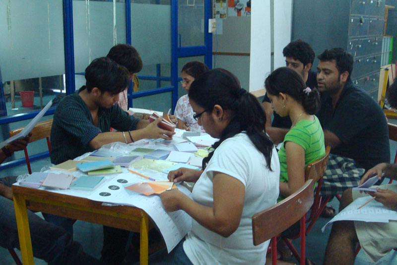
Exercise-7:
Exploration and Exercises - Colour Preference:
Duration:
2 hours, Individual Exercise.
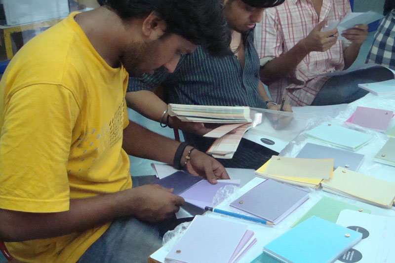
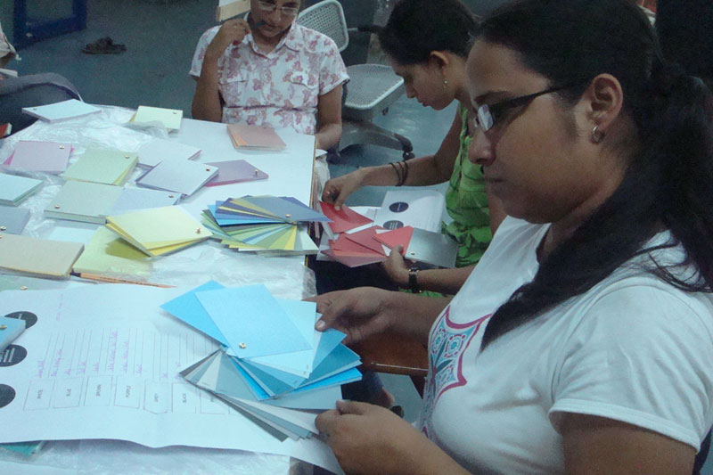
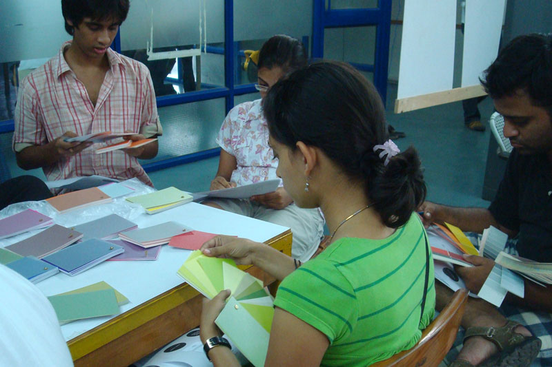
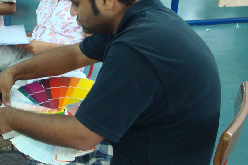
Objective:
Associations play an important role in determining the attitude towards a colour. Associations can tell us objects and experiences connected with them.
A simple tool developed at the colour studio, was used as a preparatory exercise for the last exercise which was to deal with the application of colour in a space.
Mode:
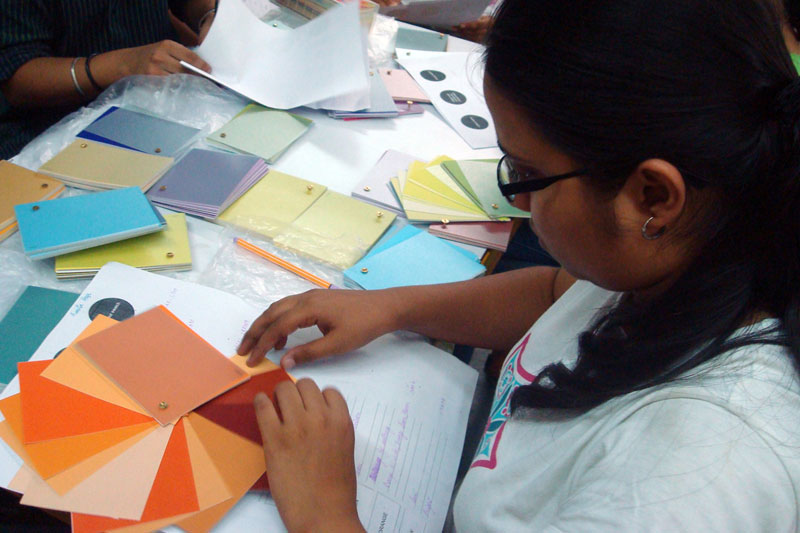
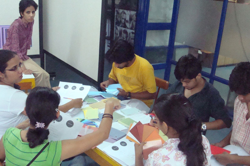
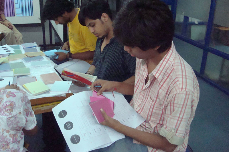
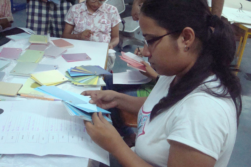
• The student was asked to arrange the cards in the order of their preference of colours along with written reasons for the most liked/ disliked colour.
• They are then given the colour stimulus and asked to point out the exact variant of the colour liked or disliked.
Materials:
Work sheet, Visual stimuli
Discussion in the Class:
Order of merit, 11 colour cultural set, Object and Emotional associations of colours.
Observations:
Favored colours, in the order of most to least:
1. WHITE 4 people
2. BLACK 3 people
3. BLUE 2 people
4. ORANGE 2 people
5. RED 1 person
6. GREEN 1 person
The following were the association students made with each of the 11 colours in the set:
WHITE:
Snow, milk-crystal peak, ice cream, apple laptops, friendship, perfection, sonnet, lily, peace, cotton, soft, pure, comfortable, marble, paint, peace, spatial, done, serenity-cotton wool.
BLACK:
A dark room/ space, concentration, meditation-100% black, hair, dark, night, sky at night, tunnel, hair, burkha, death, blank, dead end, end, shoe polish, paint, mysterious, elegant-carbon copy.
BLUE:
Sky, vast, cool, sea, sky after rain, calmness, soothing, sky, calmness, peacefulness.
BROWN:
Earth, Calm, Natural, Subtle, Colour of the bark, Rich, Pride, Dignified, Mud, Terracotta, Earthy.
PURPLE:
Graphs, rich fabric, royal, rich, flower, cool, joyful, happy, dusk, energetic, royal.
GREY:
Concrete steel, cold, concrete, plaster, dull, unfinished, cement, sophistication.
PINK:
Flowers, lotus, sweet, color of my room, yawar, sweet, girly, frock, feminine, cute, pink dollop.
RED:
Letter box, ambulance, danger, to get attention, rose, blood, signs, love anger attraction, loud, apple, dynamic.
GREEN:
Grass, eye soothing, colour of the chinar leaf, rich, deep thought, fields, farms, freshness.
ORANGE:
Orange, mirinda, orange sun, flowers.
YELLOW:
Sunflower, vibrant-summer yellow, sun, bright, earth, sand, traditional, earthy.