Jump to navigation

  •  
  •  
  •  

  • Courses
  • Resources
  • Case study
  • Showcase
  • Tools
  • Gallery
  • Videos

Search form

Animation Design Communication Design Design Fundamentals Interaction Design Product Design Tools for Design Open Design
Home / Courses / Colour and Composition / Module2-Hue Compostion

.

top unblocked 76 games free access unblocked games 76 now latest unblocked online games kays games unblocked access retro bowl unlimited play play retro bowl without block cool math brain games free school-friendly unblocked games yohoho io game online lesson guru hack and help play baseball bros unblocked classroom 6x games to play 76
Design Course

Colour and Composition

Colour Composition in Design Framework
by
Ms. Nijoo Dubey
NID, Bengaluru
Module2-Hue Compostion
 
  • Printer-friendly version

Exercise-2:

Exploration and Exercises - Hue Composition:
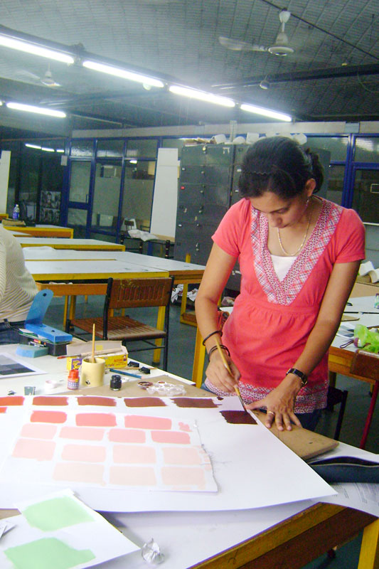
Duration:

1 day, Individual Exercise.

Objective:
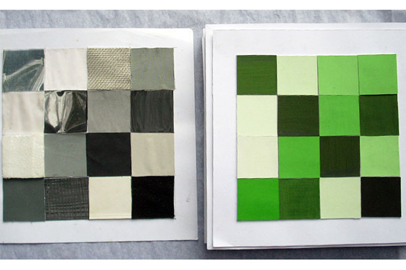
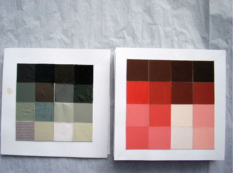
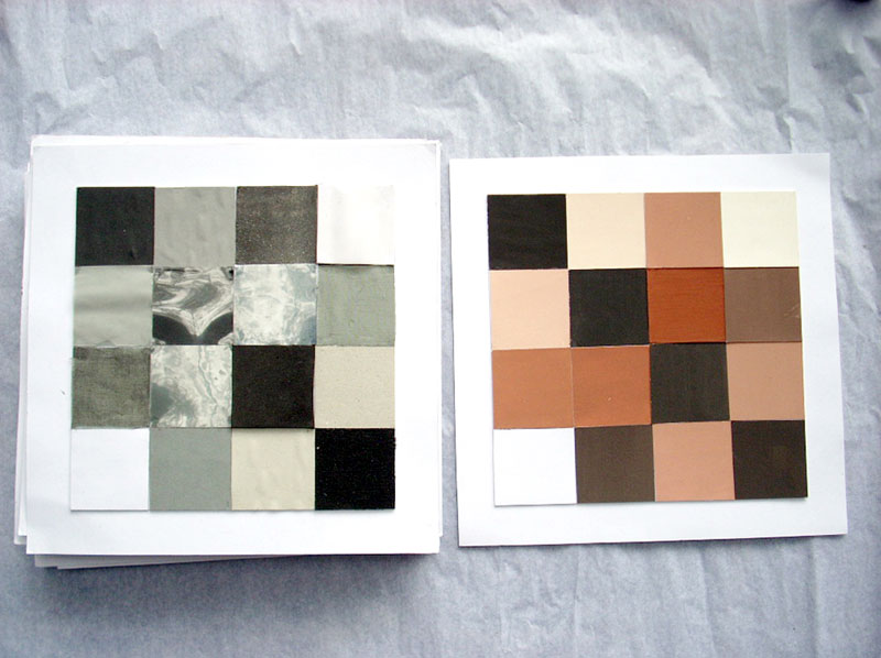
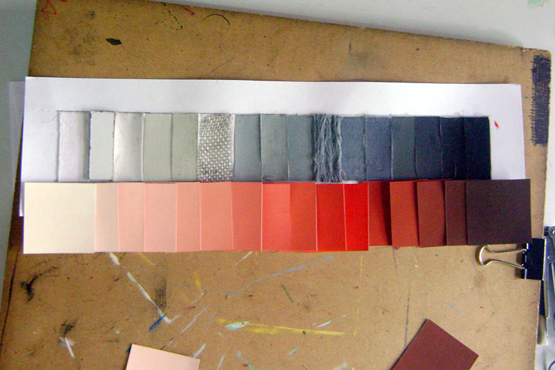
Different hues behave in their own way to addition of a different colour. The exercise was designed to sharpen the student’s sensitivity to a very perceptual quality of color: “Brilliance” and in turn make the student receptive to shading.

Mode:
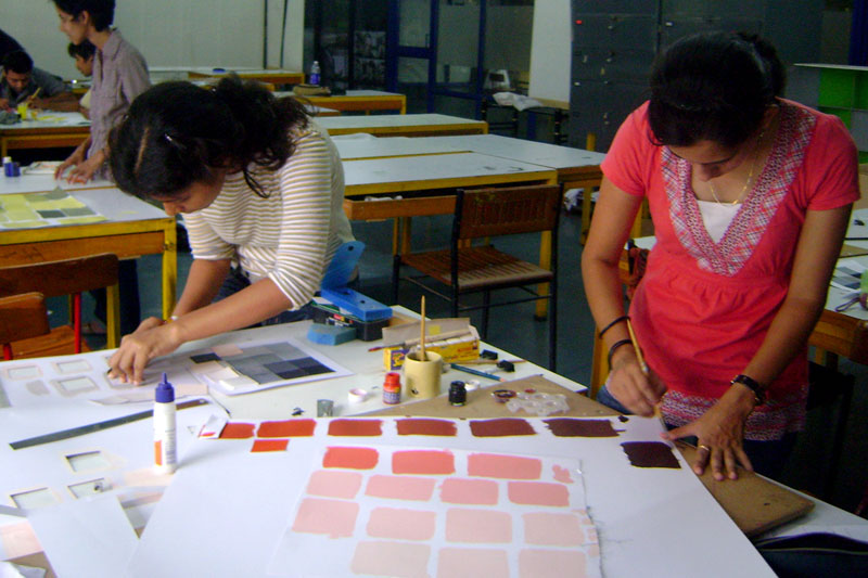
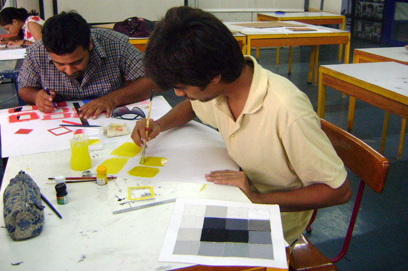
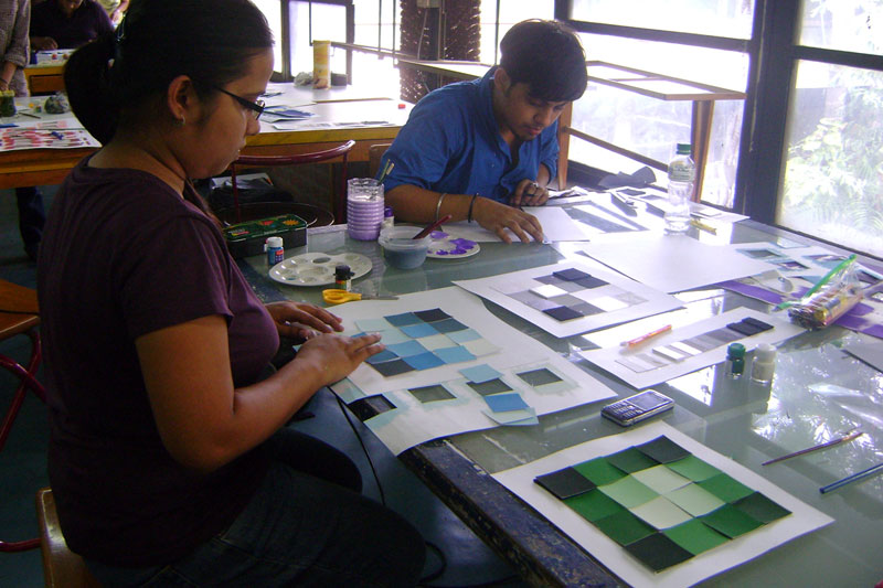
Replicate the composition made in Exercise-1 in one hue out of the following-Poster red, lemon yellow, Prussian blue, light green, orange, violet, yellow ocher, pink (341), peacock blue, poster green, vermillion, flesh tint, burnt sienna, chrome yellow (085).

Materials:
Paint and Brush

Discussion in the Class:
Simultaneous contrast

Observations:
Once the intention was clearly defined to the students they were quick to grasp the concept and apply it to their respective compositions.

There were two typical ways in which the students carried out the exercise:
• Develop shades and tints of the pure hue and then replicate the composition done in    Exercise-1.
• The second approach was to first find that specific shade/tint of gray from the gray scale    that matched the pure hue in brilliance. And then develop appropriate number of shades or    tints required. For instance the student would be making more shades than tints in a pure    yellow composition or in the case of purple the number of tints would be more.

col-sm-4
col-sm-4
col-sm-4
col-sm-6
col-sm-6
col-sm-4
col-sm-4
col-sm-4
col-sm-12

‹ › ×

    • Introduction
    • Module1-Grey and Hue Scale
    • Module2-Hue Compostion
    • Module3-Noughts and Cross
    • Module4-Colour Interaction
    • Module5-Colour and Form
    • Module6-Colour and Culture
    • Module7-Colour Preference
    • Module8-Colour and Space
    • Video
    • Design Tools
    • Downloads
    • Contact Details
    • Credits

    Creating Digital-learning Environment for Design


    • Courses
    • Resources
    • Case study
    • Showcase
    • Tools
    • Gallery
    • Videos
    • Animation Design
    • Communication Design
    • Design Fundamentals
    • Interaction Design
    • Product Design
    • Tools for Design
    • Open Design
    • Contribute to our Dsource
    • About
    • People
    • Events
    • Job@D'source
    • Contact Us
    • Privacy Policy
    • Download App
    • YouTube
    • Facebook
    • Twitter

    Indian Language
    English Bangali Gujarati Hindi
    Kannada Malayalam Marathi Punjabi
    Sindhi Tamil Telugu Urdu