Jump to navigation

  •  
  •  
  •  

  • Courses
  • Resources
  • Case study
  • Showcase
  • Tools
  • Gallery
  • Videos

Search form

Animation Design Communication Design Design Fundamentals Interaction Design Product Design Tools for Design Open Design
Home / Courses / Visual Perception for Communication Designers / 11. Appendix / 11.3 Appendix C: Eye and the Light

.

top unblocked 76 games free access unblocked games 76 now latest unblocked online games kays games unblocked access retro bowl unlimited play play retro bowl without block cool math brain games free school-friendly unblocked games yohoho io game online lesson guru hack and help play baseball bros unblocked classroom 6x games to play 76
Design Course

Visual Perception for Communication Designers

Human Factors and Sociotechnical Systems Studios
by
Vivek Kant and Sruthi Sridhar
IDC, IIT Bombay
11.3 Appendix C: Eye and the Light
 
  • Printer-friendly version

In this section, we very briefly list out the basic definitions of light and its relation to vision. This appendix is meant to be a quick reference rather than an exhaustive resource.
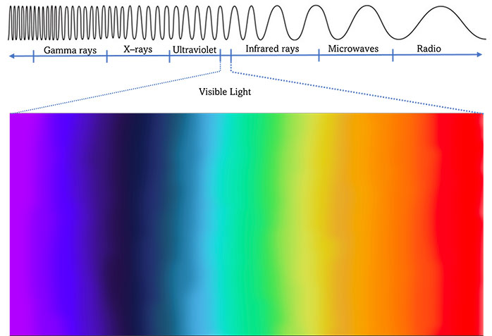

Figure 11.3.a
Source: Sruthi Sridhar. Recreated from Goldstein, 2010 (page 44)


Visible light, a band of energy within the electromagnetic spectrum, helps form vision. The electromagnetic spectrum is a continuous range of electromagnetic energy emitted as waves. These waves provide the three aspects of light which affect our perception of light: Colour or Hue, Brightness, and Saturation.

Colour or hue is determined by the length of the wave on the visible spectrum. Longer wavelengths are found towards the red end of the spectrum, whereas shorter wavelengths are located towards the blue end of the spectrum.

Brightness is determined by the highs or lows of the waves (amplitude). The lower the wave, the dimmer the light appears to be. High waves are brighter.
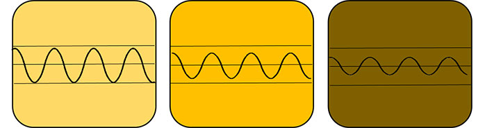

Figure 11.3.b
Source: Sruthi Sridhar


Finally, saturation is the degree to which humans perceive colour purity. A highly saturated blue would only have blue wavelengths, whereas a less saturated blue would have a mix of wavelengths. For example, when painting a picture, if we paint the ‘ocean’ blue using poster colours, the paint on the paper would look ‘pure’ blue, but if we mix white paint to make the ‘sky’ blue, it will look like the lighter version of the ‘blue ocean’. The hue/colour of the sky is still blue but a less saturated version of the ocean blue due to the mixture of white wavelengths.
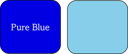

Figure 11.3.c
Source: Sruthi Sridhar


  • 1. Introduction
  • 2. Nature of Visual Experience
  • 3. Figure-ground Segregation
  • 4. Edges, Lines and Angles
  • 5. Color and Lightness
  • 6. Illusory Motion
  • 7. Size and Distance
  • 8. Depth and Perspective
  • 9. Perception, Attention and Change
  • 10. Conclusion
  • 11. Appendix
    • 11.1 Appendix A: Eye and the Brain
    • 11.2 Appendix B: Gestalt thought and its precursors
    • 11.3 Appendix C: Eye and the Light
  • 12. References
  • Downloads
  • Contact Details
  • Credits

Creating Digital-learning Environment for Design


  • Courses
  • Resources
  • Case study
  • Showcase
  • Tools
  • Gallery
  • Videos
  • Animation Design
  • Communication Design
  • Design Fundamentals
  • Interaction Design
  • Product Design
  • Tools for Design
  • Open Design
  • Contribute to our Dsource
  • About
  • People
  • Events
  • Job@D'source
  • Contact Us
  • Privacy Policy
  • Download App
  • YouTube
  • Facebook
  • Twitter

Indian Language
English Bangali Gujarati Hindi
Kannada Malayalam Marathi Punjabi
Sindhi Tamil Telugu Urdu