Information Architecture
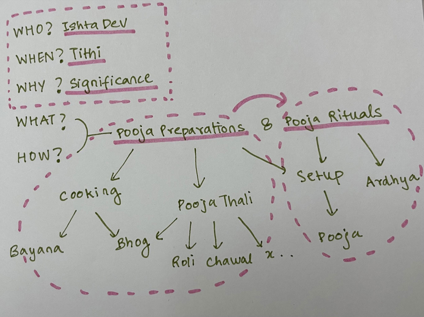
Based on the final data organisation an information architecture was created for the visualisation (see Fig 9).
Two major chunks of pooja preparations and pooja rituals were identified. The 4 W and 1 H questions were answered to curate the content in the form of a synopsis.
Fig 9. Information Architecture
Medium
Web visualisation was finalised as the medium for the visualisation. This medium would ensure greater reach of the visualisation. It would enable interactivity and possibility to build further on the same visualisation.
Web visualisation would also be easily accessible to the upcoming tech savvy generation for whom this visualization is primarily intended.
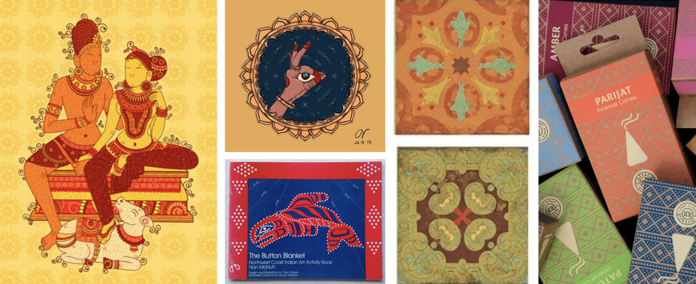
Moodboard
A moodboard was created by compiling relevant images to help ideate a visual style (see Fig 10).
Fig 10. Moodboard
Visual Style
A visual style was finalised for the visualization.
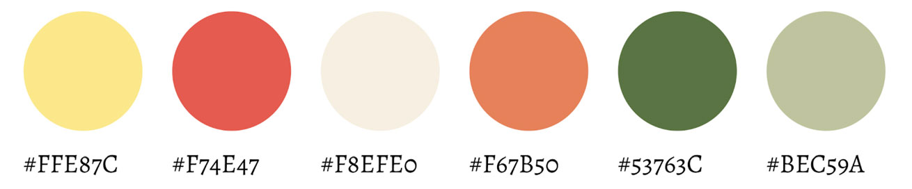
Colours
The colours yellow and red were primarily used as they are considered religiously auspicious.
A colour palette was created to represent the essential pooja articles (see Fig 11).
Fig 11. Colour Palette
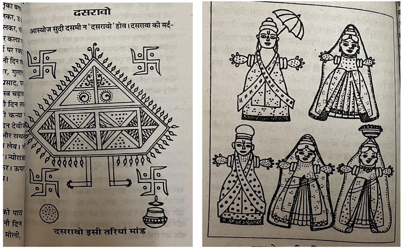
Illustrations
Illustrations were used instead of images to maintain consistency and bring out the aesthetic of Indian festivals.
Illustration styles used in existing religious books were looked at (see Fig 12). Line drawing was used to represent different Gods as well as processes.
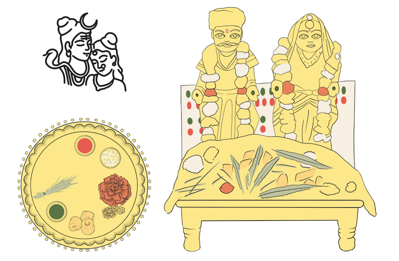
A similar line drawing style was derived to illustrate the Gods, pooja thali and pooja (see Fig 13) in the final visualisation. A base colour of yellow was used and only the essential pooja articles were highlighted using different colours.
Fig 12. Illustrations in religious books
Fig 13. Some illustrations of Gods, pooja thali and pooja
Typography
The typeface Alegreya was used for the visualisation. Alegreya regular 14 pt - Body Text
Alegreya bold 18 pt - Heading 2 Alegreya regular 12 pt - Captions Alegreya bold 56 pt - Heading 1
Icons
Outlined icons were used as they were coherent with the illustration style (see Fig 14).
Fig 14. Outlined Icons
Explorations
Different ways of information organisation were experimented with.
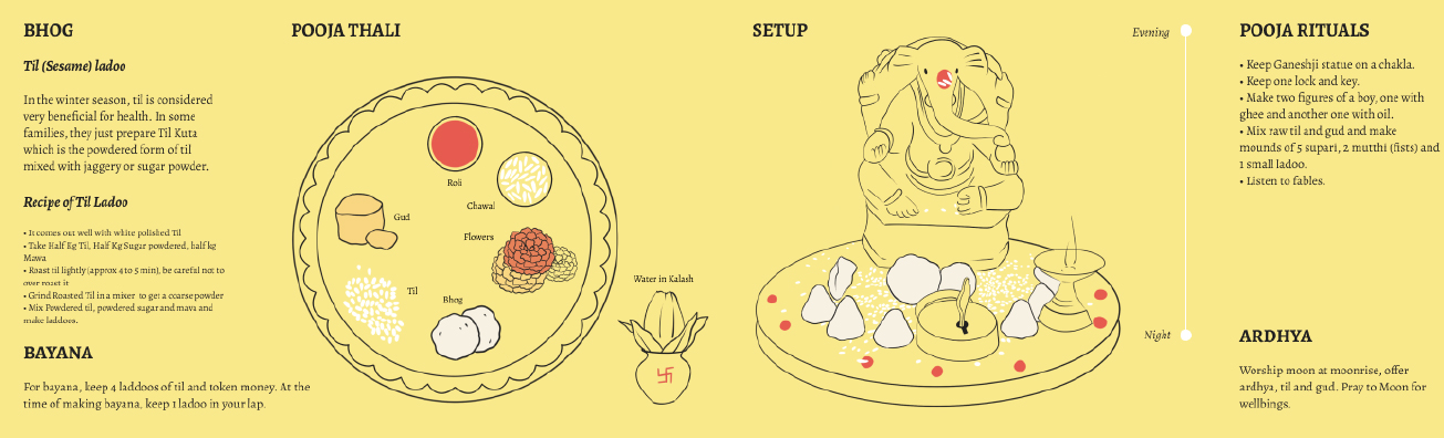
A six column layout which would work both as a web visualisation and a printed book was created. The top highlighted the primary information. The left-hand side consisted of the pooja preparations and the right, the pooja rituals. A vertical timeline was used for the pooja rituals. Colour was used to visualise the cooking and storytelling activities (see Fig 15 a). A reverse colour version was also experimented with (see Fig 15 b).
Fig 15. a. 6 column exploration (T) b. Reverse colours (B)
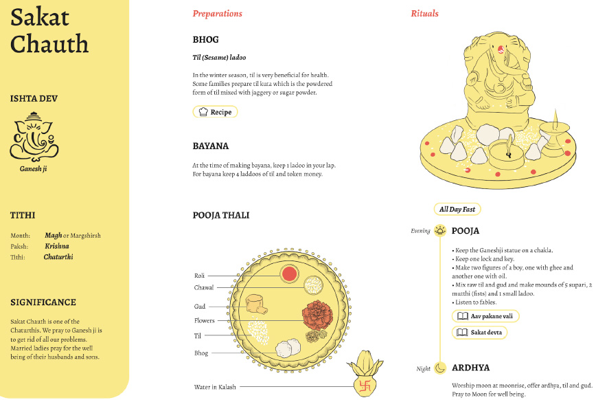
A three column layout which was more appropriate for web visualisation was then created. The primary information was highlighted in the 1st column, the preparations were visualised in the 2nd column and the rituals in the 3rd. Different ways to organise the content were explored (see Fig 16).
Fig 16. 3 column exploration
Feedback
Feedback from my guide as well as peer feedback was incorporated to improve the information organisation and visual aesthetic of the information visualisation.
-
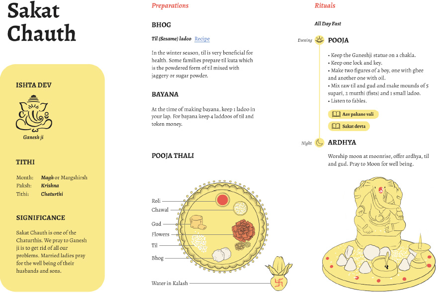
A three column grid was finalised - who, when and why were visualised in the first column with the highest priority, the second column consisted of pooja preparations and the third column consisted of pooja rituals (what, how).
-
The pooja thali illustration was improved to serve as a diagram with clearer labels (see Fig 17).
Fig 17. Pooja Thali (L), Pooja Thali based on feedback
-
Visualisation of the tithi was also not included in the information visualisation as it would deviate attention from the topic and would be a whole different complex topic to understand.
-
Stories and songs were highlighted as tags.
-
Icons were included in the timeline.
-
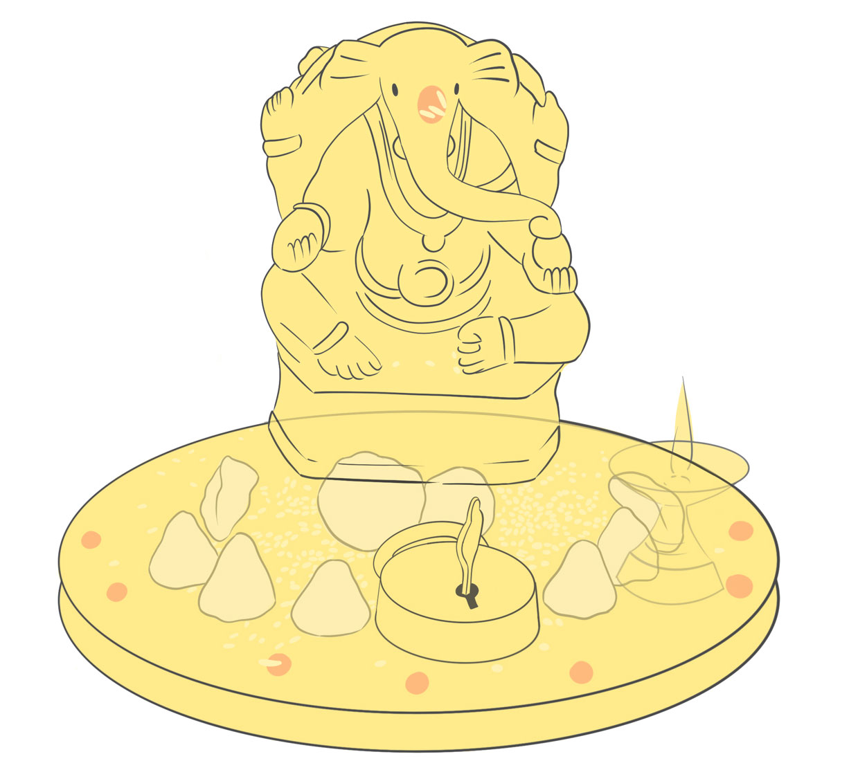
The static illustrations of the pooja were converted into gifs to visually represent the step-by-step process involved in the pooja rituals (see Fig 18).
Fig 18. Making of the Sakat Chauth gif
- An introduction to the visualisation and glossary were also included.